library(tidyverse)
library(dplyr)
library(Hmisc)
library(ggplot2)
library(corrplot)
library(lubridate)
library(nycOpenData)Juvenile Rearrest Rates and Juvenile Supervision Caseloads in New York City
Public Safety
Social Issues
This project examines recent trends in juvenile rearrest rates and juvenile supervision caseloads in New York City from 2023 to 2025. Using NYC Open Data, the analysis explores patterns over time through correlations and visualizations, with the broader goal of developing a stronger, more comprehensive project on youth justice outcomes for future presentation.
Author: Isley Jean-Pierre
Final Project
This is a project that I hope to present at the NYC OpenData conference next spring. I must admit that there are some datasets that I intended to use for this final assignment, but because of time and roadblocks, I will focus on the two keys datasets for now. My goal is to keep on this project by finding a meaningful way to include the other datasets. I believe that this project has the potential to become something special.
Let’s load the dataset first
rea <- nycOpenData::nyc_dop_juvenile_rearrest_rate(limit= 10000)
head(rea)
# A tibble: 6 × 4
borough month year rate
<chr> <chr> <chr> <chr>
1 Citywide January 2026 4.6
2 Citywide September 2025 4.5
3 Citywide December 2025 4.4
4 Citywide July 2025 5.3
5 Citywide October 2025 4.4
6 Citywide August 2025 4.6 Let’s focus on the years between 2023 and 2025
rea_clean <- rea %>%
  filter(year >= 2023 & year <= 2025)

head(rea_clean)
# A tibble: 6 × 4
borough month year rate
<chr> <chr> <chr> <chr>
1 Citywide September 2025 4.5
2 Citywide December 2025 4.4
3 Citywide July 2025 5.3
4 Citywide October 2025 4.4
5 Citywide August 2025 4.6
6 Citywide November 2025 4.5 Let’s create a new column that contains month and year
rea_clean <- rea_clean %>%
  mutate(
    month_year = paste(month,year, sep = " "),
    month_year = my(month_year)
  )
Removing the previous columns
rea_clean <- rea_clean %>%
  select(-month, -year)
Let’s see if we can find a correlation between rearrest rates and date Before that let’s make sure that the columns are in the right format
str(rea_clean)tibble [36 × 3] (S3: tbl_df/tbl/data.frame)
$ borough : chr [1:36] "Citywide" "Citywide" "Citywide" "Citywide" ...
$ rate : chr [1:36] "4.5" "4.4" "5.3" "4.4" ...
$ month_year: Date[1:36], format: "2025-09-01" "2025-12-01" ...To see the structure.
rea_clean <- rea_clean %>%
  mutate(
    rate = as.numeric(rate)  # Making rate into numeric instead of character
  )
Let’s look at the sum of rearrest rates per year
sum_year <- rea_clean %>%
  mutate(year = year(month_year)) %>%
  group_by(year) %>%
  summarise(
    total_rate = sum(rate, na.rm = TRUE)
  )
sum_year
# A tibble: 3 × 2
year total_rate
<dbl> <dbl>
1 2023 38.8
2 2024 43.3
3 2025 53.6For fun, let’s look at the average rearrest rates per year
avg_rea_year <- rea_clean %>%
  mutate(year = year(month_year)) %>%
  group_by(year) %>%
  summarise(
    mean_rate = mean(rate, na.rm = TRUE)
  )
avg_rea_year
# A tibble: 3 × 2
year mean_rate
<dbl> <dbl>
1 2023 3.23
2 2024 3.61
3 2025 4.47Investigating the months
Let’s take a closer look to see if there are some months where rearrest rates are higher than others
month_repeat <- rea_clean %>%
  mutate(month = month(month_year, label = TRUE)) %>%
  group_by(month) %>%
  summarise(
    mean_rate = mean(rate, na.rm = TRUE)
  )
month_repeat
# A tibble: 12 × 2
month mean_rate
<ord> <dbl>
1 Jan 3.5
2 Feb 3.57
3 Mar 3.67
4 Apr 3.73
5 May 3.73
6 Jun 3.87
7 Jul 4.27
8 Aug 3.8
9 Sep 3.73
10 Oct 3.73
11 Nov 3.87
12 Dec 3.77Let’s finally see if we can find a correlation between rearrest rates and year
cor(as.numeric(rea_clean$rate), as.numeric(rea_clean$month_year))[1] 0.7071394It seems that there is indeed a strong correlation between rearrest rates and year with r = 0.69.
Trying to run a correlation Matrix
rea_cor <- rea_clean %>%
  mutate(
    year         = lubridate::year(month_year),
    month        = lubridate::month(month_year)
  ) %>%
  select(rate, year, month)
cor_matrix <- cor(rea_cor)
cor_matrix rate year month
rate 1.0000000 0.7097743 0.1139991
year 0.7097743 1.0000000 0.0000000
month 0.1139991 0.0000000 1.0000000Building the Correlation Matrix
corrplot(cor_matrix, method = "color", addCoef.col = "orange")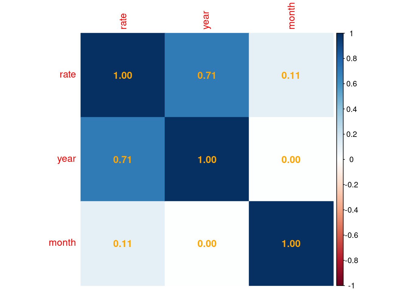
Playing with ggplot
ggplot(rea_clean, aes(x = month_year, y = rate)) +
  geom_line(color = "green", size = 1) +
  geom_point(color = "black", size = 2) +
  geom_smooth(method = "loess", se = FALSE, color = "red", linetype = "dashed") +
  labs(
    title = "Rearrest Rates Over Time",
    x = "Year",
    y = "Rate"
  ) +
  theme_minimal()
Warning: Using `size` aesthetic for lines was deprecated in ggplot2 3.4.0.
ℹ Please use `linewidth` instead.`geom_smooth()` using formula = 'y ~ x'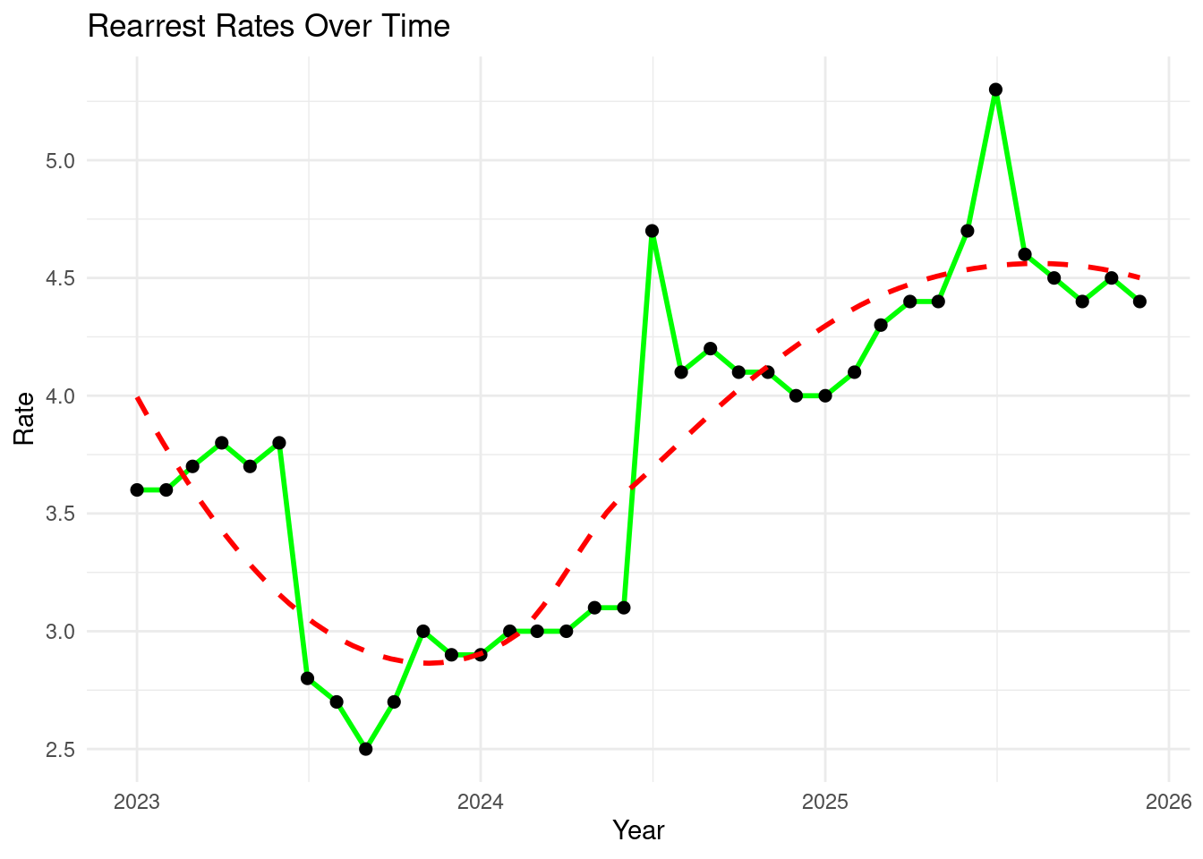
Playing with ggplot (adding months into the graph)
ggplot(rea_clean, aes(x = month_year, y = rate)) +
  geom_line(color = "lightblue", size = 1) +
  geom_point(color = "orange", size = 2) +
  labs(
    title = "Rearrest Rates Over Time",
    subtitle = "Monthly Data",
    x = "Year",
    y = "Rate"
  ) +
  scale_x_date(date_breaks = "3 months", date_labels = "%b %Y") +
  theme_light() +
  theme(axis.text.x = element_text(angle = 45, hjust = 1))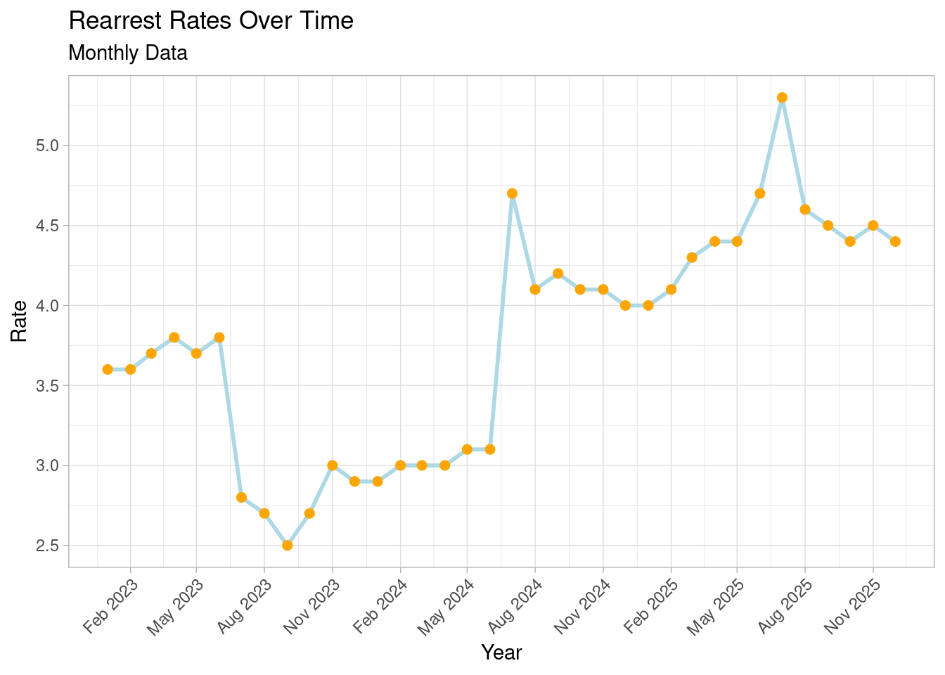
For this section, I will use another dataset
Let’s call the data
juv <- nycOpenData::nyc_dop_juvenile_cases(limit = 10000)
head(juv)
# A tibble: 6 × 5
borough supervision_caseload_type month year supervision_caseload…¹
<chr> <chr> <chr> <chr> <chr>
1 Citywide Enhanced Supervision Program Janu… 2026 279
2 Citywide Juvenile Justice Initiative Janu… 2026 135
3 Citywide IMPACT Janu… 2026 0
4 Citywide Advocate Intervene Mentor Janu… 2026 36
5 Citywide Every Child Has An Opportunity To… Janu… 2026 0
6 Citywide General Supervision Janu… 2026 640
# ℹ abbreviated name: ¹supervision_caseload_countLet’s look into the data from 2023 until 2025
juv_clean <- juv %>%
  filter(year >= 2023 & year <= 2025)
head(juv_clean)
# A tibble: 6 × 5
borough supervision_caseload_type month year supervision_caseload…¹
<chr> <chr> <chr> <chr> <chr>
1 Citywide Juvenile Justice Initiative Dece… 2025 126
2 Citywide Advocate Intervene Mentor Dece… 2025 37
3 Citywide Enhanced Supervision Program Dece… 2025 285
4 Citywide Pathways to Excellence Achievemen… Dece… 2025 0
5 Citywide General Supervision Dece… 2025 630
6 Citywide IMPACT Dece… 2025 0
# ℹ abbreviated name: ¹supervision_caseload_countlet’s combine month and year together
juv_clean <- juv_clean %>%
  mutate(
    month_year = paste(month,year, sep = " "),
    month_year = my(month_year)
  )
head(juv_clean)
# A tibble: 6 × 6
borough supervision_caseload_…¹ month year supervision_caseload…² month_year
<chr> <chr> <chr> <chr> <chr> <date>
1 Citywide Juvenile Justice Initi… Dece… 2025 126 2025-12-01
2 Citywide Advocate Intervene Men… Dece… 2025 37 2025-12-01
3 Citywide Enhanced Supervision P… Dece… 2025 285 2025-12-01
4 Citywide Pathways to Excellence… Dece… 2025 0 2025-12-01
5 Citywide General Supervision Dece… 2025 630 2025-12-01
6 Citywide IMPACT Dece… 2025 0 2025-12-01
# ℹ abbreviated names: ¹supervision_caseload_type, ²supervision_caseload_countRemoving unwanted columns
juv_clean <- juv_clean %>%
  select(-month, -year)
Let’s play around
Let’s see if we can find a correlation between rearrest rates and date but before that let’s make sure that the columns are in the right format.
str(juv_clean)tibble [211 × 4] (S3: tbl_df/tbl/data.frame)
$ borough : chr [1:211] "Citywide" "Citywide" "Citywide" "Citywide" ...
$ supervision_caseload_type : chr [1:211] "Juvenile Justice Initiative" "Advocate Intervene Mentor" "Enhanced Supervision Program" "Pathways to Excellence Achievement and Knowledge" ...
$ supervision_caseload_count: chr [1:211] "126" "37" "285" "0" ...
$ month_year : Date[1:211], format: "2025-12-01" "2025-12-01" ...To look at the structure.
Let’s see… (mutating scc form character to numeric)
juv_clean <- juv_clean %>%
  mutate(supervision_caseload_count = as.numeric(supervision_caseload_count))
juv_clean %>%
group_by(supervision_caseload_type) %>%
summarise(mean_count = mean(supervision_caseload_count, na.rm = TRUE))# A tibble: 7 × 2
supervision_caseload_type mean_count
<chr> <dbl>
1 Advocate Intervene Mentor 18.4
2 Enhanced Supervision Program 209.
3 Every Child Has An Opportunity To Excel And Succeed 7.89
4 General Supervision 537.
5 IMPACT 0
6 Juvenile Justice Initiative 94.0
7 Pathways to Excellence Achievement and Knowledge 0 Let’s run a correlation
cor(juv_clean$supervision_caseload_count, as.numeric(juv_clean$month_year))[1] 0.05729952There is a very weak correlation (r = 0.06) between Supervision Caseload Count and Year.
Let’s visualize the data
juv_clean %>%
  group_by(supervision_caseload_type) %>%
summarise(mean_count = mean(supervision_caseload_count, na.rm = TRUE)) %>%
ggplot(aes(x = reorder(supervision_caseload_type, mean_count), y = mean_count, fill = supervision_caseload_type)) +
geom_col(show.legend = FALSE) +
coord_flip() +
labs(
title = "Average Supervision Caseload Count by Program",
x = "Program Type",
y = "Average Caseload Count"
) +
theme_minimal()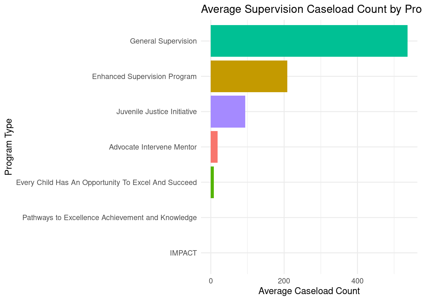
Let’s investigate further
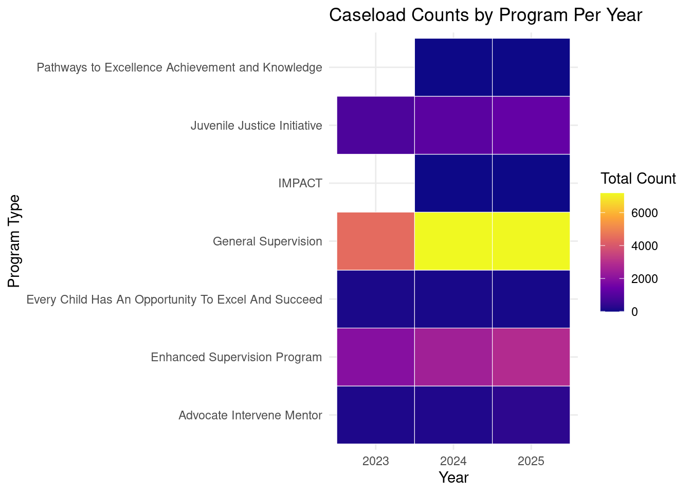
Let’s try to include years into the graph.
juv_year <- juv_clean %>%
  mutate(year = year(month_year)) %>%
  group_by(supervision_caseload_type, year) %>%
  summarise(
    total_count = sum(supervision_caseload_count, na.rm = TRUE),
    .groups = "drop"
)ggplot(juv_year, aes(x = factor(year), y = supervision_caseload_type, fill = total_count)) +
geom_tile(color = "white") +
scale_fill_viridis_c(option = "C") +
labs(
title = "Caseload Counts by Program Per Year",
x = "Year",
y = "Program Type",
fill = "Total Count"
) +
theme_minimal()